Digital whiteboards are having a moment.
San Francisco-based MURAL reports that its visual collaboration workspace is used by 43 percent of Fortune Global 100 enterprises with, in some cases, up to 72,000 active members per month in a single firm.
Billy Kiely, VP of product design at InVision, said that its digital product design and development platform is used by all Fortune 100 companies and has seven million users around the world; InVision’s new virtual whiteboard tool, Freehand, has seen 130 percent growth in weekly active users since March.
The collaborative whiteboard Miro — which two weeks ago launched its Live Embed API, allowing Microsoft Teams, Airtable, Atlassian and Notion users to bring Miro boards directly into their core user experiences — has a user base of six million people, with nearly one million active users weekly, according to Iris Latour, a customer insights lead at Miro.
The need for new ways to collaborate amid the COVID-19 pandemic is undoubtedly one factor contributing to the explosive growth of these tools.
“The loss of a physical office equates to the loss of one centerpiece for group meetings, planning sessions and brainstorms,” Latour said.
But the trend also reflects high rates of adoption by enterprise-level firms who are shifting to flatter, more web-like organizational structures as they undergo digital transformation, said Celeste Olivieri, head of product design at MURAL.
The loss of a physical office equates to the loss of one centerpiece for group meetings, planning sessions and brainstorms.”
As members of different departments, customers and consultants come together to strategize and jointly develop products and services, digital whiteboards serve as a common meeting space — a destination for hosting agile rituals and brainstorming sessions; collating research findings; and conducting diagramming exercises, retrospectives and design sprints.
“Designers were really our early adopters,” Latour said. “But right now, I think that is shifting. Miro is kind of this horizontal tool, right? We see product managers use it for task tracking or to connect with developers for Jira tasks and issues. But it’s also used a lot by HR teams and customer experience teams,” she said.
For a backstage look at the user experience of the three platforms, Built In spoke with Kiely, Latour and Olivieri. They took us on a tour of their respective platforms, with an eye for how visual displays, navigation features and facilitator controls reflect distinct design philosophies and customer profiles.

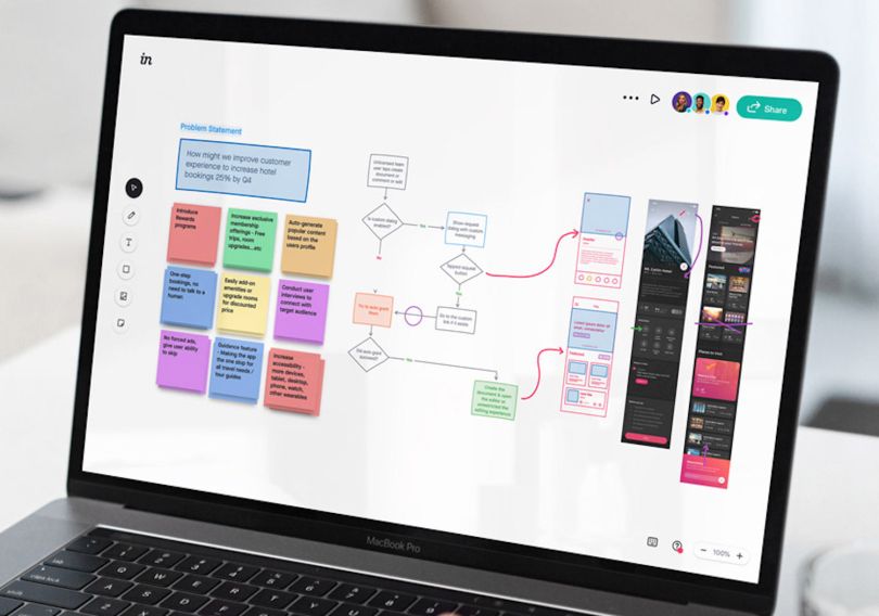
InVision’s Freehand Recreates That Napkin-Sketch Feeling
Open Freehand and you’ll find an almost entirely blank page, with minimal tooling on the left-hand side of the display anchoring an otherwise unobstructed workspace.
This minimalist approach is intentional, Kiely said: “We’re really trying to keep true to this being a blank whiteboard and make it feel like it is this hand-drawn, tangible place that creativity happens.”
The approachability of the interface, and its preference for speed of expression to the perfection of visual ideas, is rooted in two of InVision’s core design principles, according to Kiely: first, that “power is not visible, it is felt,” and second, that design should “be inclusive, not selective.”
“Before these digital tools,” Kiely said, “these sorts of meetings would happen by sketching on a napkin, or drawing on a piece of paper, or something. That’s very tangible but also very disposable. You could quickly sketch out an idea, and you could throw it all away and go back to the drawing board.”
We’re really trying to keep true to this being a blank whiteboard and make it feel like it is this hand-drawn, tangible place that creativity happens.”
Freehand tries to mimic that lo-fi, low-pressure creation mode, Kiely told me. Sketches can be constructed with little knowledge of design tooling or shortcut commands. Drawings feel as though they can be erased. The board’s ephemeral quality makes it less intimidating for stakeholders to get involved earlier in the design process, he said.
“When things become too digitized, it often feels like a presentation instead of an environment that invites collaboration,” Kiely said. “That’s where we’ve seen, like, tenfold engagement from stakeholders and collaborators who actually feel like they can participate in these sessions when we’re presenting early design concepts, rather than feeling like they can only approve or disapprove.”
Another distinguishing feature of Freehand is the marker tool, which engineers trained to automatically smooth the curves of wobbly shapes and letters, Kiely said. If you’ve ever been embarrassed by the clumsy look of your signature after drawing it with a mouse or tracing it with your index finger on a trackpad, you’ll appreciate this feature.
“There's a ton of energy we poured into perfecting the digital stroke and really wanting to make your mouse or trackpad feel like that marker that you have in a co-located space,” Kiely said.
The concept of an “infinite canvas,” which all three platforms offer in varied ways, allows users to scroll horizontally to open space, much in the way an illustrator might unwind paper from a large scroll to start a new idea or continue with a multi-page concept. Much of the work is preserved outside the visual dimensions of the screen. Thus, contextuality — giving uses the tools they need when they need them — is important in keeping the experience intuitive and free flowing. Options to change the opacity, color or function of a line (making it an arrowhead, for instance) appear in a pop-up menu when you lift your hand from the mouse or track-pad.
“We always want functionality to be achieved without actually touching a button,” Kiely said.
Freehand is integrated with InVision’s suite of design collaboration tools, which live under a single account. While Freehand is built to host early brainstorming sessions, design reviews, retrospectives and higher-fidelity prototype development, Kiely told me, the real power of the platform lies in its integration with other tools, such as Sketch, InVision Studio, Inspiration tools for mind mapping and Design System Manager.
“Something that also makes Freehand unique is just how powerful it is in the design critique and review process,” Kiely said. “We have integrations with other design tools, where you can basically take whatever’s on the canvas of your design tool and send it to a Freehand.”
“You can package these things up and invite collaborators to not only see the ideation work, but also watch that progress,” Kiely said. “And the exciting thing is design isn’t a linear process anymore. It’s very, very iterative, especially as developers get involved.”
For InVision, a fully remote company with 700 employees across 25 countries, years of internal experimentation across time zones, teams and business functions has helped refine the platform — an edge Kiely believes it has over competitors.
“Being distributed and remote in a world that wasn’t yet distributed and remote, we built a lot of our tools to solve our own problems, internally. And because we’re relying on collaboration and doing it remotely, we were able to really vet some of the tooling and see what sticks,” Kiely said.

Miro Is All About Shareability and Collaboration
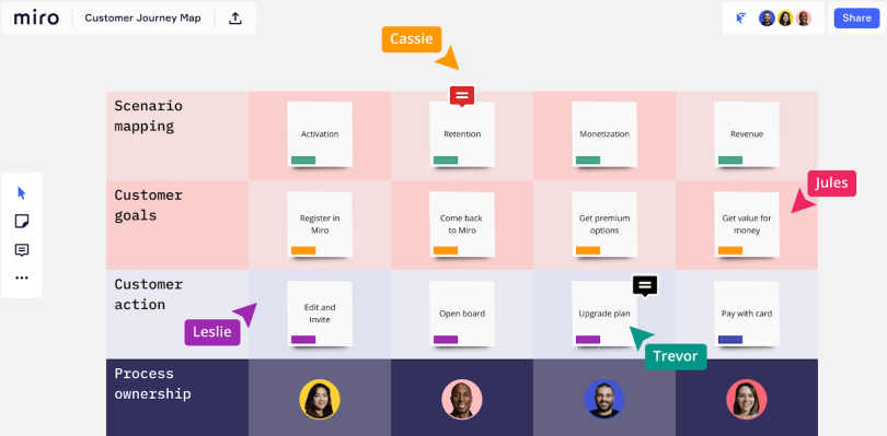
The key metaphor driving Miro, Latour said, is the frame. It’s a fitting tool for a San Francisco-based company that draws inspiration from the legendary Spanish artist Joan Miro. Frames are easily resizable squares that function as placeholders for a range of content — from scratch-rendered customer personas and user journey maps to templates for meetings, ideation workshops and strategy sessions.
“I wonder if anyone would roll their eyes at me for saying this,” Latour said, “but I’m just obsessed with frames. I think frames are so powerful.”
The reason why, she told me, is that frames are sized for standard paper and presentation sizes — the international paper standard A4 (8.25” by 11.75”), for example, or 8.5’’ by 11” for exporting as an image to PDF. Not only can frames be moved easily around the board; they can be selected and printed to be shared as unique artifacts or played in presentation mode directly on the board. In effect, you can create a slide show similar to one in a PowerPoint presentation, without leaving Miro.
Another distinguishing feature of frames is that they can be selected as independently operating links and dropped in the chat stream of a third-party platform, such as Zoom. “And anyone who clicks on the link, whether they’re on the board or not, it will take them to that part of the board.”
I wonder if anyone would roll their eyes at me for saying this, but I’m just obsessed with frames. I think frames are so powerful.”
The key metaphor driving Miro, Latour said, is the frame. It’s a fitting tool for a San Francisco-based company that draws inspiration from the legendary Spanish artist Joan Miro. Frames are easily resizable squares that function as placeholders for a range of content — from scratch-rendered customer personas and user journey maps to templates for meetings, ideation workshops and strategy sessions.
“I wonder if anyone would roll their eyes at me for saying this,” Latour said, “but I’m just obsessed with frames. I think frames are so powerful.”
The reason why, she told me, is that frames are sized for standard paper and presentation sizes — the international paper standard A4 (8.25” by 11.75”), for example, or 8.5’’ by 11” for exporting as an image to PDF. Not only can frames be moved easily around the board; they can be selected and printed to be shared as unique artifacts or played in presentation mode directly on the board. In effect, you can create a slide show similar to one in a PowerPoint presentation, without leaving Miro.
Another distinguishing feature of frames is that they can be selected as independently operating links and dropped in the chat stream of a third-party platform, such as Zoom. “And anyone who clicks on the link, whether they’re on the board or not, it will take them to that part of the board.”
“And if you really like an idea that someone else has you can give them a plus or a thumbs up [with emoji],” Latour said. “People are able to really interact with the input of others in real time.”
Latour also touts a wireframing tool that allows designers to develop customized visual libraries and create linked pathways between mock-up Web and mobile frames. Typically, Miro is used for roughing out early stage ideas, she said, but more detailed InVision, Sketch and Figma prototypes can be brought into the board by embedding the source code.
The breadth of information that can live on a Miro board — from customer research and Typeform surveys to clustering exercises and journey maps — is one reason Miro includes a Google-style search bar near the top of the screen, Latour said. Colored tags allow teams to flag important items and assign project responsibilities to particular roles. These tagged items are filtered to the top of the search results, making it easy to assess recent progress at a glance and cull insights from design sprints, research data and retrospectives.
“I don’t really think of [Miro] so much as a competitor to other tools, but a competitor to the physical whiteboard and the physical sticky note,” she said. “The water cooler moments — that’s really what Miro is adding; teams being able to really work together and improve their processes. Because once you run a quick retrospective, this lives on the board forever. It becomes a single source of truth.”

Mural Provides Templates and Tools for Facilitators
MURAL is, on the one hand, a visual collaboration tool for design teams, Olivieri said. But its robust architecture and powerful facilitator controls reflect its broader ambitions as a destination site for departmental managers, agile strategists, remote facilitation experts and university professors.
In recent months, according to Taylor, MURAL has landed several multi-million-dollar annual contracts with Fortune Global 500 companies, and is now used by C-Suite teams at some of the world’s largest and most operationally complex companies, including IBM, E-Trade, Intuit, SAP, Atlassian, Autodesk and GitHub, according to Taylor.
“It’s not just for design teams,” Olivieri said. “Enterprise companies are undergoing big transformations and they need to innovate faster and promote design thinking and agile practices for every single team in the company. And those practices need templates and places to happen.”
Many of these templates — from icebreakers to retrospectives to design sprints — were developed by MURAL Playmakers, Olivieri said, a collection of design agencies and innovation consultants with names like the Luma Institute, XPlane, Voltage Control, New Haircut and Somersault Innovation, who are not only experts in the software but work to promote it to their clients.
“Blank canvases with freedom are great for some scenarios and users,” Olivieri said. “But we also needed to provide templates to help users go through the journey of learning new [design thinking] methods.”
MURAL’s main interaction model, she said, is an expansive drag-and-drop environment. Users can pull activity templates, sticky notes and icons from the left-hand sidebar to populate the canvas. Files from MURAL can be exported in PDF, png, or ZIP formats and embedded in Jira, GitHub, and other tools.
Google’s design team uses MURAL’s whiteboard to host five-day remote design sprints. As described in the Remote Design Sprint Guide by authors Jake Knapp, John Zeratsky and Jackie Colburn, a global MURAL template provides a workspace for the sprint, and a facilitator assigns unique areas for individuals to work over the course of the week. Each day focuses on a different theme: mapping, sketching, deciding, prototyping and testing.
Participants can use tools like MURAL and Miro, the authors write, to lay out goals, organize interview notes and HMWs (How Might Wes) and sketch “lightning demos.” The board is shaped around “the most important customer” and emphasizes a key moment in their product experience.
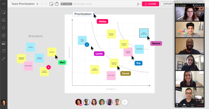
Sticky notes serve as the tool de jour, Olivieri said. They can be sketched on, used as placeholders for questions and comments, and arranged in series to create storyboard mock-ups. Dot voting, similar to Miro’s, is a way to quickly generate informal “heat maps” showing which ideas are resonating. For more formal voting, facilitators can conduct anonymous straw polls. Pressing and holding the X key activates a shortcut command to zoom into the interface via a magnifying glass icon — a useful feature to read text on the sprawling canvas.
Unlike Miro and Freehand, Olivieri said, MURAL’s visual collaboration platform is intentionally directed at facilitators, who are granted “superpowers” within the system and take the reins on set-up and navigation. They can organize outlines, control a timer to keep meetings on schedule and summon participants to a canvas.
Granting such power to facilitators stems from MURAL’s customer base, Olivieri said, which includes a high percentage of enterprise clients whose leaders may supervise teams who are new to design thinking and new to the system.
With new and casual users in mind, education is also given high priority on the interface. Live weekly video demonstrations and online tutorials cover topics ranging from remote collaboration to design thinking, “the idea that at the moment you are thinking about different ways to solve a problem you need to involve different roles,” Olivieri said. “Not just the designer with fancy ideas, but people from customer success, for example. People who know more about the problem than you.”
Because whiteboarding sessions happen, in some cases, daily, and can last nearly an entire workday, making the experience fun for end users is crucial to MURAL’s approach. An icebreaker exercise developed by Ross Chapman of Etch Sprints, for example, asks participants to sketch themselves using wardrobe icons, then share their costumed selfies with the group. A celebrate feature, also popular with users, makes it rain confetti when teams accomplish a goal or reach a new milestone.
Perks like these, Olivieri said, can change the group dynamics and energy of online meetings and provide some much needed comic relief.
“Right now everyone is jumping into MURAL or other tools to collaborate online,” she said. “Of course, it’s really challenging to have six-hour sessions every day during a work week. There are a lot of things we are doing from a design standpoint to make that experience more delightful and more inclusive for all kinds of users.”


